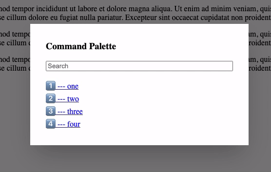
Command Palette
Vue Omnibar
Create modal popups that emulate omnibar, command palette, open anywhere, or other "search and act" functions/features
Project
Demo
Or press shift p
Features
- built-in filtering using Fuse.js
- custom key combo support
- listens for
esckey - bring your own styling (basic styles included)
- arrow key support
- uses slots for best flexibility
- "off-click" closes the modal
Installation
npm install vue-omnibar
Global Usage
import Vue from 'vue';
import Omnibar from 'vue-omnibar';

Vue.component('omnibar', Omnibar);
In Single File Components
import Omnibar from 'vue-omnibar';

export default {
  // ...
  components: {
    Omnibar,
  },
  // ...
};
Usage
<template>
  <div id="app">
    <omnibar :data="data" :initial="data.slice(0, 4)">
      <h3 slot="header">Command Palette</h3>
      <!-- the data to show when nothing has been typed -->
      <!-- if the initial data is empty, nothing is shown -->
      <template #initial="{ initial }">
        <div v-for="item in initial" :key="item" class="omnibar-search-initial-list">
          <a href="#" @click.prevent="handleClick(item)" v-text="item"></a>
        </div>
      </template>
      <!-- the filtered results based on the what is being typed -->
      <template #results="{ results }">
        <div v-for="item in results" :key="item" class="omnibar-search-results-list">
          <a href="#" @click.prevent="handleClick(item)" v-text="item"></a>
        </div>
      </template>
    </omnibar>
  </div>
</template>

<script lang="ts">
import Vue from 'vue';
import Omnibar from '@/omnibar.vue';

export default Vue.extend({
  name: 'OmnibarExample',
  components: {
    Omnibar
  },
  data() {
    return {
      data: [
        '1️⃣ --- one',
        '2️⃣ --- two',
        '3️⃣ --- three',
        '4️⃣ --- four',
        '5️⃣ --- five',
        '6️⃣ --- six',
      ]
    };
  },
  methods: {
    handleClick(item: any) {
      window.alert(item);
    }
  },
});
</script>

<style type="text/css">
.omnibar-search-list a {
  display: inline-block;
  width: 100%;
}
</style>
Opening Programmatically
<!-- the `openOmnibar` event can be called anyway and will trigger the modal to open -->
<button type="button" @click.prevent="$root.$emit('openOmnibar')">Show Omnibar</button>
<!-- if there is a `name`, the event will have the name appended: `'openOmnibar.myName'` -->
<button type="button" @click.prevent="$root.$emit('openOmnibar.myName')">Show "myName" modal</button>
<!-- you can also close the modal with the opposite event: `'closeOmnibar.myName'` -->
<button type="button" @click.prevent="$root.$emit('closeOmnibar.myName')">Close "myName" modal</button>
Available Props
- name:
string | boolean | null- namespace the modal and the open event (default:'') - data:
Array<any | Record<string, any>>- the data to filter when typing (required) - initial:
Array<any | Record<string, any>>- the data to show when the field is empty (default:[]) - keybinding:
Array<string> | null- combination of keys that need to be pressed (default:['shift', 'p']) - shadow:
boolean- add a shadow to the view box (default:true) - overlay:
boolean- show an overlay under the view box (default:true) - options:
Fuse.IFuseOptions<string>- options to pass to Fuse.js (see options page) (default:{})
Development
npm run serve: run a development server with a theserve.vuepagenpm run build: generate the build output